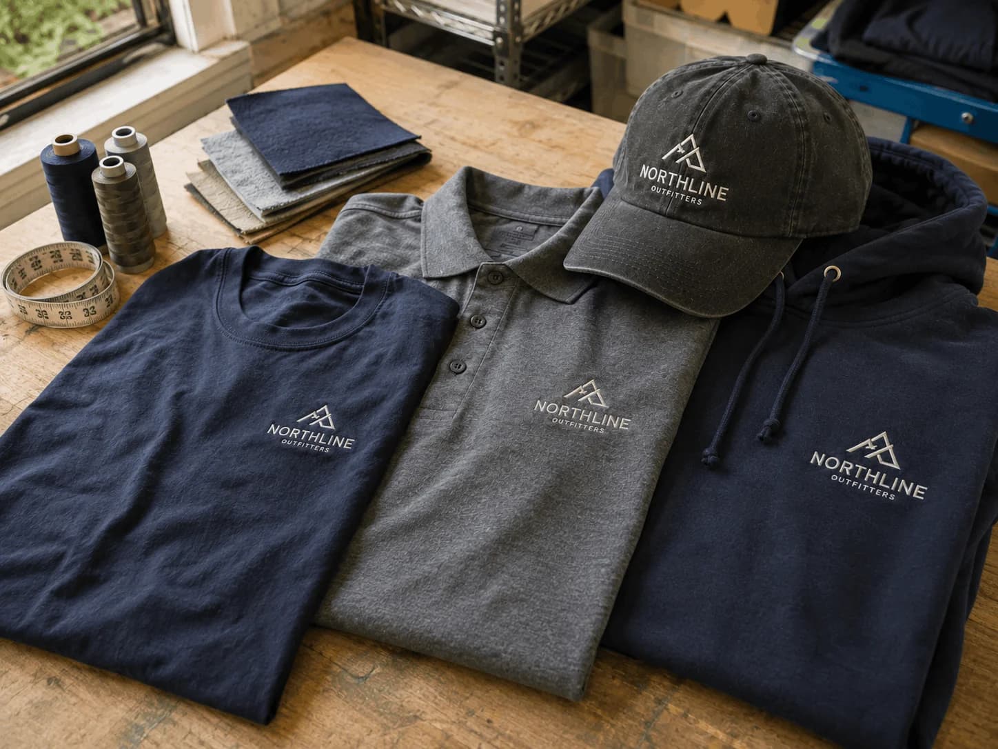
One Logo, Different Apparel: How to Make It Look Right Every Time
August 7, 2026
Your logo may stay the same, but the apparel it appears on does not.
A design that looks clean and balanced on a T-shirt can feel oversized on a polo, disappear on a hat, or sit awkwardly on a hoodie. That is why successful custom apparel involves more than placing the same logo file on every garment.
Logo size, position, fabric, garment construction, decoration method, and color contrast can all influence the finished appearance. Whether you are ordering uniforms, promotional shirts, branded hats, polos, hoodies, workwear, or custom logo shirts, adapting the artwork to each product helps create a more consistent and professional result.
The goal is not to make every garment identical. It is to make every garment look unmistakably connected to the same brand.
Why the Same Logo Looks Different on Different Apparel
A logo starts as a digital design, but apparel gives it a physical surface.
That surface changes from product to product. A cotton T-shirt usually provides a large, relatively flat printing area. A polo introduces a collar and button placket. A structured cap has curved panels, seams, and limited decoration space. A hoodie may include drawstrings, a kangaroo pocket, a zipper, thick seams, and heavier fabric.
These differences affect how the same artwork appears.
A wide horizontal logo may look perfectly balanced across a T-shirt but become too compressed on a hat. Fine lettering that is easy to read in a large front print may become difficult to recognize when reduced for a small left-chest application.
A detailed design may also reproduce beautifully with DTF or DTG printing while requiring some simplification before it can be embroidered clearly.
Good apparel branding considers the garment before production begins instead of forcing the same treatment onto every item.
Custom Apparel Starts With the Right Logo File
Before deciding where the logo should go, make sure the artwork is ready for production.
Whenever possible, use a vector file such as AI, EPS, SVG, or a suitable production-ready PDF. Vector artwork can be resized without losing sharpness, making it especially useful when the same logo needs to appear across several types of custom apparel.
High-resolution PNG or JPG files can also work for certain printing applications. Problems are more likely when artwork has been copied from a website, downloaded from social media, taken from a screenshot, or saved at a very small size.
Production artwork should have clean edges, accurate brand colors, correct proportions, readable text, proper spacing, and a transparent background when needed.
It is also useful to keep several approved logo variations. Your primary full-color logo may work well on a T-shirt, while a white or black version may provide better contrast on certain garment colors. A stacked logo may work in a compact area, while a simplified icon, monogram, or brand mark can be more effective on hats or sleeves.
Preparing these versions in advance makes it much easier to maintain consistency across an apparel collection.
Logo Placement on Shirts Should Start With Purpose
There is no single perfect logo placement on shirts. The strongest position depends on how the garment will be used and what you want the design to communicate.
A left-chest logo is one of the most dependable choices for business apparel. It works particularly well on employee uniforms, polos, work shirts, corporate clothing, hospitality apparel, and event staff shirts.
The logo remains noticeable without dominating the garment, which is why this placement is commonly associated with a clean, professional appearance.
A full-front design creates considerably more visual impact. It can work well for promotional T-shirts, events, branded giveaways, school apparel, organization shirts, and marketing campaigns. A larger decoration area also gives detailed logos and designs containing additional text more room to remain readable.
The back of a shirt provides another valuable branding area. Businesses often pair a small front logo with a larger back logo, company message, contact information, or promotional statement.
Sleeves can provide space for secondary branding, while a small logo below the back neckline can create a more subtle brand detail.
The strongest placement is not automatically the biggest one. It is the placement that works naturally with the garment and its intended purpose.
Finding the Right Logo Size for Shirts
The correct logo size for shirts is about proportion, readability, and visual balance.
If a logo is too small, fine text and important details can disappear. If it is too large, the artwork may overpower the garment and make professional clothing feel more promotional than polished.
For many designs, a left-chest logo approximately three to four inches wide can be a useful starting point. Larger front or back designs may be around 10 to 14 inches wide on many adult garments, while sleeve and back-neck applications are normally considerably smaller.
These dimensions should be treated as starting points rather than universal rules.
A wide horizontal logo should not automatically use the same dimensions as a square or circular mark. Logo proportions, amount of text, garment size, placement area, decoration method, and desired visibility should all influence the final size.
If an order includes several apparel sizes, review how the design looks across smaller and larger garments rather than assuming one dimension will feel equally balanced on every size.
T Shirt Logo Placement Should Match Real-World Use
When producing custom t shirts, consider how people will actually wear and see them.
For employees who regularly interact with customers, a smaller chest logo can provide clear branding while maintaining a professional appearance.
For an event shirt, a larger centered graphic may make more sense because visibility is more important. Promotional apparel may benefit from a smaller front logo combined with a larger back design so the brand can be recognized from different directions.
Effective t shirt logo placement balances visibility, comfort, and consistency.
A placement can technically fit within the available printing area and still look wrong when the garment is worn. Artwork positioned too close to the neckline, for example, can feel cramped. A graphic positioned too low may appear disconnected from the upper body.
The final position should therefore be reviewed on the actual garment or through an accurate production proof.
Polos Need a More Refined Approach
Polos are commonly used for employee uniforms, sales teams, contractors, hospitality businesses, trade shows, and corporate events.
Because a polo already has visual structure from the collar and button placket, branding generally works best when it complements the garment rather than competing with it.
A left-chest logo is a popular choice because it provides recognition without overwhelming the shirt.
Embroidery works particularly well on many polos because the stitched finish can reinforce their professional appearance.
However, not every logo should be embroidered exactly as it appears on a computer screen. Extremely small text, delicate lines, gradients, or intricate details may need to be simplified to remain clear once reproduced with thread.
Hats Require a Different Logo Strategy
Caps and other headwear provide much less decoration space than shirts.
Their curved surfaces, panels, and seams also create restrictions that do not exist on a flat T-shirt.
A logo designed for a large shirt print may therefore need to be adapted before it is placed on a hat. Small words can become difficult to read, fine details may disappear, and a very wide logo may need to be reduced until it loses impact.
A simplified brand mark, icon, monogram, stacked logo, or shortened version of the primary logo can often create a stronger result.
Using an alternate logo on a hat does not weaken brand consistency. If the colors, typography, shapes, and overall identity remain recognizable, the design can still clearly belong to the same brand.
Hoodies and Sweatshirts Give You More Creative Space
Hoodies offer generous branding space, but they also introduce additional design considerations.
Drawstrings, kangaroo pockets, zippers, thick seams, and heavier fabric can influence where the artwork should appear.
A small left-chest logo can create a subtle branded look, while a larger back design offers greater visibility. Upper-chest graphics and sleeve branding can also work well depending on the purpose of the garment.
Zip-up hoodies require extra planning because standard artwork generally should not cross the zipper unless the design and decoration process have been specifically prepared for that application.
Having more available space does not mean every area should be filled. Strong apparel branding still depends on balance.
Jackets and Workwear Need Durability as Well as Style
Branded jackets, vests, uniforms, and workwear often serve a practical purpose in addition to promoting the business.
A jacket worn regularly by a contractor or field employee has very different requirements from a promotional T-shirt worn at a one-day event.
Fabric weight, stretch, weather resistance, seams, pockets, zippers, and working conditions can all influence the best decoration approach.
The logo should remain visible and professional without interfering with the function of the garment. The decoration method must also be compatible with the material.
A process that performs well on a lightweight cotton T-shirt may not automatically be the best choice for heavier outerwear or specialized work clothing.
DTF, DTG or Embroidery: Which Works Better for Your Logo?
The garment is only part of the decision. The decoration method can significantly affect how your finished logo looks.
DTF Printing
Direct-to-film printing can reproduce detailed, colorful artwork across a wide range of compatible fabrics.
It works especially well for designs containing multiple colors, gradients, illustrations, fine details, or complex graphical elements. This makes DTF a flexible option for many types of branded apparel.
Garment material, artwork quality, application, and production settings still influence the result, so the design should be reviewed for the specific product being decorated.
DTG Printing
Direct-to-garment printing applies ink directly to compatible fabric and is commonly used for detailed or full-color artwork, particularly on suitable cotton-based garments.
DTG can be a strong choice for custom t shirts featuring illustrations, detailed graphics, several colors, or smaller production runs.
The garment composition, artwork characteristics, and desired finished appearance should all be considered before selecting the process.
Embroidery
Embroidery creates a logo with thread rather than ink.
It is frequently used on polos, hats, jackets, uniforms, and other professional apparel because it can provide a durable, polished appearance.
However, detailed digital artwork does not always translate perfectly into stitches. Tiny lettering, extremely thin lines, gradients, and intricate elements may need to be simplified.
When ordering custom embroidered apparel, reviewing the artwork for embroidery compatibility before production can produce a much cleaner final result.
Your Logo Does Not Always Need to Be Identical
One common branding mistake is assuming every garment needs exactly the same version of the logo.
Professional brands often maintain several approved variations.
A primary logo may work well on a T-shirt or jacket. A horizontal version may fit a wider decoration area. A stacked version may work better within a compact space, while an icon or monogram may be more effective on hats or sleeves.
A single-color or reversed logo can also be useful when the original design does not provide enough contrast against the garment.
Consistency does not mean identical execution. It means every version should remain recognizable as part of the same brand.
Consider the Apparel Color Before Production
Garment color has a major influence on logo visibility.
A dark logo on a dark shirt may disappear. A light design on a white garment can have the same problem.
Depending on the garment, you may need approved white, black, light, dark, single-color, or reversed versions of your logo.
Color can also appear somewhat different depending on the fabric and decoration method. Printed color and embroidery thread, for example, may not reproduce a brand color in exactly the same way.
The goal should be strong visual consistency and brand recognition rather than assuming every material will produce an identical result.
Keep Branding Consistent Across the Entire Apparel Order
If your business is ordering T-shirts, polos, hoodies, hats, jackets, and workwear together, review them as one coordinated collection rather than separate products.
Logo colors should feel consistent, every variation should remain recognizable, and each placement should suit the individual garment.
A hat does not need the same logo dimensions as a T-shirt, and a polo does not need the same placement as a hoodie.
For recurring orders, a simple apparel branding guide can help. Document approved logo files, alternate versions, preferred placements, general size guidance, approved colors, and the decoration methods normally used for each garment.
Also document what should be avoided, such as stretched logos, unapproved colors, artwork crossing problematic seams or zippers, and important details reduced until they are unreadable.
Consistency comes from making these differences intentional.
Common Logo Mistakes to Avoid
Even a strong logo can produce disappointing apparel when it is not adapted properly.
Making the logo too large is a common mistake. Bigger does not automatically create stronger branding, especially on professional uniforms.
Going too small creates the opposite problem because company names, taglines, and important visual details can disappear at normal viewing distance.
Tiny lettering is particularly risky. Text that looks sharp on a screen may not reproduce clearly when printed or embroidered at a small size.
Garment construction should never be ignored. Buttons, collars, seams, pockets, drawstrings, panels, and zippers can interfere with placement.
Low-resolution artwork can also reduce finished quality.
Finally, choose the decoration method with both the design and garment in mind. A detailed full-color graphic and a simple embroidered company logo have very different production requirements.
Before Approving Custom Logo Shirts
Before sending custom logo shirts or other branded apparel into production, carefully review the final proof.
Make sure the artwork is sharp and readable, the logo proportions have not been stretched, and the placement suits the garment. Check for conflicts with pockets, seams, buttons, collars, drawstrings, or zippers.
Confirm that the logo has enough contrast against the garment color and that the selected DTF, DTG, or embroidery method suits the design.
If several garment sizes are included, make sure the artwork still feels balanced across the range.
A few minutes spent reviewing these details before production can prevent problems that are much harder to correct afterward.
Make Your Logo Work on Every Garment
One logo can successfully represent your company across T-shirts, polos, hats, hoodies, jackets, uniforms, workwear, and promotional products, but every garment deserves its own design consideration.
Start with production-ready artwork. Choose the right logo placement on shirts and other products. Adjust the size according to the available decoration area. Match DTF, DTG, or embroidery to the artwork and garment. Maintain strong color contrast and a consistent visual identity, then carefully review the final proof before approving production.
Great custom apparel does more than display your logo. It helps your brand look recognizable, intentional, consistent, and professional every time someone wears it.
Whether you are producing custom logo shirts, custom t shirts, polos, hats, hoodies, jackets, or custom embroidered apparel, the same principle applies: adapt the logo to the garment instead of forcing every garment to use the logo in exactly the same way.
Frequently Asked Questions
What is the best logo placement on a shirt?
The best logo placement on shirts depends on the garment, artwork, purpose, and desired visibility. Left-chest logos are commonly used for uniforms and professional apparel, while larger front or back designs can work better for promotional shirts, events, and merchandise.
How big should a logo be on a T-shirt?
There is no universal logo size for shirts. A left-chest logo is often around three to four inches wide as a starting point, while larger front and back designs can be considerably wider. Logo proportions, garment size, amount of text, placement, and decoration method should determine the final dimensions.
Where should a logo go on a custom T-shirt?
Good t shirt logo placement depends on the intended use. Center-chest, left-chest, full-back, sleeve, and back-neck placements can all work. Employee custom t shirts may benefit from subtle chest branding, while event or promotional apparel can support larger graphics.
Should my logo be the same size on every apparel item?
No. A logo should normally be resized according to the available decoration area and garment type. The goal is visual consistency rather than identical dimensions.
Can the same logo be used for printing and embroidery?
Often yes, but some artwork needs adjustment. Tiny lettering, thin lines, gradients, and detailed elements may need to be simplified for custom embroidered apparel so they reproduce clearly with thread.
What type of logo file is best for custom apparel?
Vector files such as AI, EPS, SVG, and suitable production-ready PDFs are generally excellent starting formats because they can be resized without losing sharpness. High-resolution raster artwork may also work depending on the printing method.
Is embroidery or printing better for branded apparel?
Neither is automatically better. Embroidery often works well for polos, hats, jackets, uniforms, and workwear, while DTF and DTG can be strong choices for detailed or full-color artwork. The right choice depends on the logo, garment, material, design complexity, quantity, and desired appearance.
Should I use my complete logo on a hat?
Not necessarily. Because caps have limited decoration space, an icon, monogram, stacked logo, or simplified brand mark may reproduce more clearly than a wide logo containing small lettering.